
My daughter's mom gave me a small suitcase she stuffed full of fat quarters for Christmas: pink, blue, teal, orange, green, blue and yellow including darks, mediums and lights in a series of related prints. I've no idea of the designer, since the selvage edges are not marked, so it's not vintage as I thought (I recently found a remnant of the pale yellow at Joanne's), but it's nice weight fabric.
The first top I made was using colors I don't use a lot: yellow, orange and green: I had a baby shower coming up and didn't know the gender, so these colors would work. Turns out I liked it fine and for a month or two it looked great on the walls in my sewing room which my sister had painted her favorite pale green. Now it's taken it's rightful place in Brandi's home.
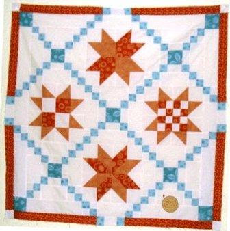
It gave me a great opportunity to play with color and intensity using those fabrics: the aqua and orange are complementary, and really stood out on the white background. Here is my rendition: in baby lap quilt size I haven't yet sandwiched and quilted yet, because the piecing is the fun part and besides I am not ready to give it away.

No comments:
Post a Comment